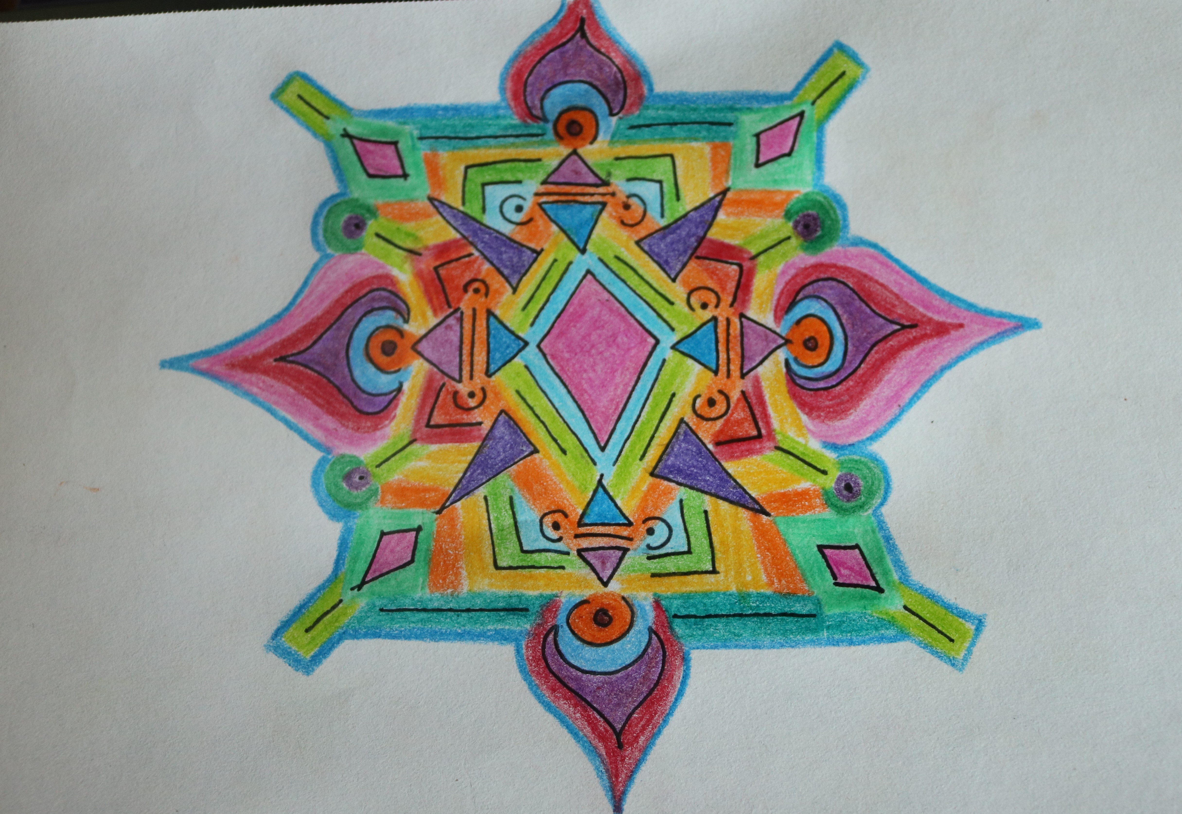
I love color.
Particularly natural color, as created by mother nature. I love naturally neon colors, such as the gifted brightness found in ripe produce, in fields cascading wild flowers, in the spectacle of dawn and dusk, in the rainbow prism of the ocean’s sparkle, in the spell of moonbeam’s night.
I love how color can augment the day. How color interacts with other colors to create a mood. How color demonstrates feelings even if unconsciously. I love the colors found in the daily life. Colors harmonizing to express feelings, impressions, moods, dynamics.
Recently I have been asking people their favorite color as a means to get to know a person. I think it is very interesting as a means of data collection and as a descriptive of their personality.
Ok so since you asked, I will go first. And of course I do not have a favorite color, I have three.
Teal is first. I love teal. Teal is the perfect blend of blue and green. Teal is a very excited blue. It is such an electric blue that it has chameleoned to a new spectrum in the color wheel, neoned into the kingdom of grass/greendom. Teal is a watery green. Teal takes the hyper out of green, toning down that deafening yellow to a more serene canary. Teal is the expressive sky meeting the grassy ground. Crimson evening kissing the verdant hills.
Teal is the color of paradise. Of that perfectly clear and deeply tropical ocean water view etching along pearly sanded shores. This bluish greenish wonderland of suspended gravity is held down by round, multi-earth colored rocks piles mountainously onto of each other. Teal makes blue more exciting and green more level headed. To me, teal is the color of eager happiness.
Magenta is second. It is so lively. Verbacious. Pungent. Demanding. It is a color that shouts. Magenta cannot be made pastel. Magenta is royalty. It is so bright that it vibrates. Magenta is an interactive color in that regard. Magenta is so naturally magnificent that it is surreal with its natural glow. Magenta flowers looks like they are garden flowers on acid, they have become wildly extraordinary. To me, magenta is the color of love.
Periwinkle is third. Periwinkle is my pastel color of choice. After such a loud start to the show with teal and magenta as the opening act, periwinkle is the soothing cream for all that burn. It is vibrant with its ultra violet gaze, and it is subtle with its sublime mystery.
Periwinkle is a multidimensional color. It changes color around with its ultraviolet gaze. More than any other color, periwinkle is alive. It creates action in the changing from day to night. It cannot be faked or recreated, periwinkle is a moment, periwinkle is a transition. It is a magical color because of how other colors behave in its presence. It is the ghostwriter of sunsets brilliance, its the conductor to the symphony of the suns departure, it is the baseline to the symphony of Mr. moon’s grand entrance. You can try to mimic periwinkle with dyes and pixels, but it cannot be replicated. To me, periwinkle is the color of deep serenity, introspection, and simple peace.
I like undecided colors. I like colors that represents a complicated set of hues. I can never answer a simple question.
So what’s your favorite color?
41.970313
-87.663045